Designing & Building an AI-Powered Portfolio
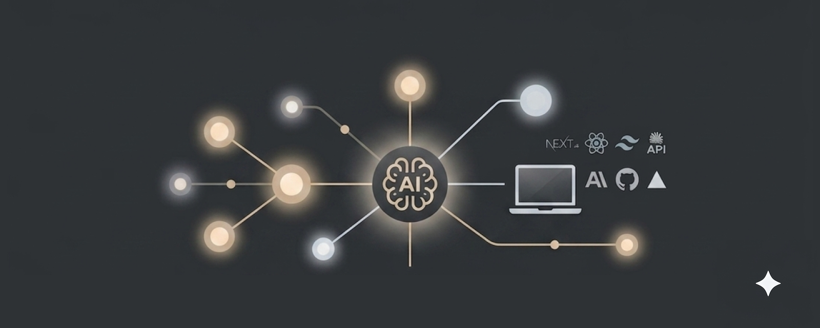
I designed and built this portfolio from scratch — a custom "chat with my portfolio" AI assistant, a server-side contact form, and a reusable case-study engine — as living proof of an AI-augmented product designer who can design and ship.
Overview
I designed and built my own portfolio from scratch — including a custom "chat with my portfolio" AI assistant and a server-side contact form — as living proof of an AI-augmented product designer who can design and ship.
The Challenge
My previous portfolio lived on a hosted builder (UXfol.io). It showcased design work but said nothing about my ability to build, or my focus on AI-augmented product design. For the AI-focused UX roles I'm targeting, I needed a portfolio that was itself evidence of the skill.
Goals
- Rebuild in a real, industry-standard front-end stack.
- Preserve my brand — palette, Mulish type, editorial sidebar.
- Ship genuine AI + backend features that demonstrate end-to-end capability.
- Learn the engineering well enough to explain every decision.
The Finished Portfolio
A look at the built site — sidebar, About, Contact, Work, and case studies.
Process & Key Decisions
Choosing the stack
I weighed vanilla HTML + Tailwind (simplest to learn), Astro (great for a content site), and Next.js. I chose Next.js because a real AI feature needs a secure server-side environment to call an LLM without exposing keys — and React/Next is the language of the AI-product teams I'm targeting. The feature drove the stack, not the trend.
Brand as a design-token system
I defined the palette and type as Tailwind v4 @theme tokens — a single source of truth. Two decisions mattered: the original brand blue (#4884fa) failed WCAG AA for small text, and its brightness clashed with the muted neutrals.
So I replaced it with a desaturated slate-blue (#3E5C78). Because everything references the token, this was a one-file change that recolored the entire site — the payoff of a token system. White-on-accent contrast lands around 7:1.
Component & data architecture
Reusable, data-driven components throughout: a fixed editorial sidebar; a résumé rendered from structured data (ATS-readable) with a PDF download; a rebuilt About page; Contact and Testimonials pages; and a Work index. Testimonials and Work each read from a single shared data file, so adding an entry updates every place it appears.
The AI feature — "Chat with my portfolio"
A floating assistant answers questions about my background, grounded only on my structured résumé data. A Next.js API route attaches that data as context and calls Claude; the API key stays server-side, never in the browser — the core reason Next.js was required.
It answers only from my data and defers to my contact links when it isn't sure — informing, not hallucinating. It's a small, honest demonstration of designing an AI feature with grounding and graceful uncertainty built in.
The Chat Assistant in Action
The grounded assistant answering a question and deferring when it should.
A reusable case-study engine
Rather than hand-build each case study, I designed a section-based template: each case study is structured data — an array of typed sections (hero, meta, two-column, columns, quote, stepper with jump-links, image+text, gallery, persona carousel, closing) rendered by one component. Authoring a new case study is a data file plus one registry line.
This paid off directly: I added the SSO Dashboard and In-House Proprietary CMS case studies as data files, mapping dozens of legacy screens onto the schema with no new page code. Systems thinking made visible.
A component system for long-form case studies
As the case studies grew, I built shared UI into the engine instead of one-off markup: a gallery carousel with an optional light/dark toggle (so a product designed in both themes can be viewed either way), a full-screen lightbox for reading dense dashboard screens at real size, and a scroll-to-top control for long pages. Each lives in the case-study layer, so every study inherits it.
Every component was type-checked in isolation before it touched the repo. When a data-file edit threw a real TypeScript error, I reproduced it and confirmed the fix cleared it before shipping.
Cohesion as a design-system decision
Two carousels — personas and final-UI screens — started to feel like they came from different kits. Rather than force them into one layout, I unified the chrome (same chevron, slate-blue arrows, active-dot treatment) while keeping each layout suited to its content: arrows overlaid on an image versus a control row beneath a tall persona card. Cohesion through a shared visual vocabulary, not identical structure — the principle a design system runs on.
Server-side contact form
A Resend-backed API route sends messages straight to my inbox — server-side, with input validation, a honeypot for spam, reply-to wired to the visitor, and graceful error states. A second secure backend integration alongside the AI assistant.
A password gate for select work
Case studies sit behind a lightweight password gate (Next.js proxy + a secret cookie), so I control who views them — with one case study left public as a showcase. Pages are gated; static assets pass through.
Designing for AI, not just with AI
I framed my positioning around designing for AI products: human-in-the-loop controls, explainable outputs, and graceful handling of uncertain results — while also using AI to accelerate my own build. AI as amplifier, not author.
Accessibility by default
Auto-scrolling marquees and the carousel respect prefers-reduced-motion; the carousel pauses on hover and is fully keyboard-navigable with 44px targets. Semantic HTML throughout (figure/blockquote, dl/dt/dd, labeled forms); the résumé is real text for screen readers and ATS; and I checked every text/background token pair against WCAG AA contrast.
Real-world problem-solving
I documented the genuine friction of building on Windows as a designer new to the terminal: installing Node and Git and fixing PATH/execution-policy issues; recovering after a stray npm audit fix --force downgraded Next.js (a lesson in why node_modules is disposable); image-quality decisions (source resolution vs. display size, transparent-PNG logos); and migrating the deprecated middleware→proxy convention and tsconfig baseUrl.
Version control
Git set up from scratch and pushed to GitHub, with a deliberate check that .env.local (API keys) stays out of the repo — the foundation for continuous deployment to Vercel.
Outcomes
Results
Live at samanthaewing.com — a self-built Next.js site that replaced the previous hosted UXfol.io portfolio. Vercel Speed Insights, measured from real visits rather than a lab test, reports a perfect Real Experience Score of 100 on both desktop and mobile, with zero layout shift. (Desktop Core Web Vitals shown; mobile also scored 100.)
What this demonstrates
- I take a design from concept to a shipped, responsive, accessible front-end.
- I integrate AI and backend services securely and thoughtfully — grounding, privacy, graceful failure — not just call an API.
- I can explain the engineering tradeoffs behind every decision.
Reflect
Learnings
- Extending a typed section engine compounds: each shared component (carousel, lightbox, scroll-to-top) improves every case study at once, and a new study becomes mostly data.
- "Cohesive" doesn't mean "identical" — matching a shared visual vocabulary resolved mismatches without forcing different content types into one layout.
- Building as a designer new to the terminal surfaced real engineering intuition: environments are disposable, keys stay server-side, and validating generated code before it lands saves hours.
Next Steps
- Keep the portfolio a living artifact — regularly refreshing content and adding relevant case studies as new work ships, rather than treating the build as one-and-done.
- Close the build–measure–learn loop on my own site: use the live Speed Insights and analytics I installed to iterate on performance and see which work visitors actually explore.
- Evolve the "chat with my portfolio" assistant — surfacing the most relevant case study for a visitor's role, and reviewing real questions to learn what recruiters care about.
Business Impact
A portfolio that is itself the proof: a designer who can take an AI-augmented product from concept through a secure, accessible, shipped front-end — and explain every decision behind it.